
As I was reading the following Information Week report, I saw this chart. And I realized it didn’t give me a good sense of well, how much data was in what type of storage. Did people have a lot of data in iSCSI pools, or a little. I found it hard to decipher.
Before:

After:
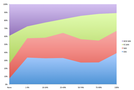
Now you can split the chart at the 50% and above mark (for storage) And see there is very little data in iSCSI and a good deal residing in DAS. What’s your take? Which is easier for you?
